The Best Colors for a Zen Meditation Corner
Share
The Best Colors for a Zen Meditation Corner
In today's fast-paced and stressful world, finding moments of peace and calm is essential for our mental and emotional well-being. One way to achieve this is by creating a Zen meditation corner in our homes, a small space dedicated to quiet reflection and mindfulness. But just like any other room in our homes, the color scheme of our meditation corner can greatly influence our mood and level of relaxation. Here are some recommendations for calming tones and textures that will help you create the perfect Zen meditation corner.
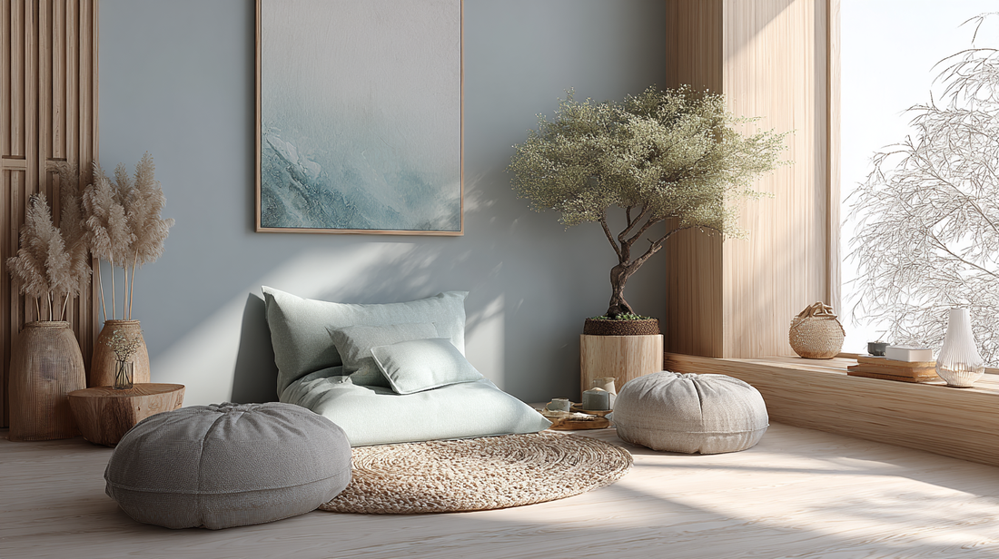
The Power of Neutrals
When it comes to creating a peaceful and harmonious space, neutral colors are always a safe bet. Shades of white, beige, and grey can help create a sense of spaciousness and serenity in your meditation corner. These colors also allow for easier focus and concentration, which is essential for a successful meditation session.
If you want to add a touch of warmth to your meditation corner, consider using natural wood tones or incorporating a few earthy elements like stones or plants. These organic textures can help ground you and bring a sense of connection to nature, which is often associated with Zen philosophy.
Soft Blues and Greens
Blue and green are often referred to as "cool" colors that are known for their calming effects. These colors are also associated with nature, making them great options for a Zen meditation corner. Soft shades of blue, like sky blue or baby blue, can evoke feelings of tranquility and peace, while greens, such as sage or mint, can promote balance and harmony.
When choosing these colors for your meditation corner, opt for lighter shades and avoid using too much of a bold, saturated color. Too much intensity can be distracting and take away from the calming atmosphere you are trying to create.
The Soothing Power of Pastels
Pastel colors, like pale pink, lavender, and peach, can also be great options for a Zen meditation corner. These colors are known for their soothing and gentle qualities, making them perfect for a space dedicated to relaxation and mindfulness.
Just like with blues and greens, it's important to stick to lighter shades of pastels and avoid using too much of a bold color. You want your meditation corner to be a place of tranquility and peace, not a jarring burst of color.
Creating Contrast
While soft and neutral colors are typically recommended for a Zen meditation corner, adding a touch of contrast can also be beneficial. A little bit of contrast can create visual interest and help keep the space from feeling too monotonous.
For example, if your meditation corner is primarily white, consider adding a pop of color with a few pillows or a small piece of wall art. This can add a touch of personality and help create a more inviting space.
Excerpt:
If you're looking to create a Zen meditation corner in your home, choosing the right colors is crucial. Soft neutrals, calming blues and greens, soothing pastels, and a touch of contrast can all help create a peaceful and harmonious space for quiet reflection and mindfulness. Don't be afraid to experiment with different shades and textures to find the perfect combination that works for you.
Ready to start creating your own Zen meditation corner? Explore My Color Den's collection of calming and mindful colors to find the perfect palette for your space. Let the power of color help you on your journey to inner peace and well-being.